Advertising 101

Good morning students. Today’s lesson is “Advertising.”
You should advertise with intent. Your ad and/or commercial should cultivate an urgency in the consumer.
“I must have this product!”
“I need this service!”
“I gotta try it!”
And the message should then motivate the target audience with a call to action.
At least that’s the way I understood it in my twenty plus years in advertising.
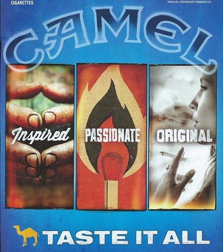
But maybe the game has changed lately…in the case of the current print ad for Camel cigarettes….
Now I’m not a smoker. Never have. And never will.
But if I wanted to start, or switch brands, what would move me (from this ad) to try Camel cigs?
It’s the image on the left that catches my eye first.
Ewww! What the hell are those?
The copy reads…”Inspired.” “Inspired” by WHAT?
Are these the fingers of a chain smoker?….Or someone who dropped the tranny of a Kenworth?
I’ve seen better looking mitts on a coal miner.
Could these fingers be a close-up of the smoker-babe on the right of the ad?
The tag line at the bottom reads….”Taste It All.” Let’s hope these hands are thoroughly washed before he or she tastes ANYTHING!
Imagine if this hand model was a nail biter. Yikes. Induce vomiting and call Poison Control right away.
And quite frankly, if your fingers look like this—is it wise to put them near open flame? My God, your digits would ignite like Michael Jackson’s hair in that Pepsi commercial.
(Class bell rings)
OK students, time’s up.
If you have an ad or commercial you hate, please share with the class with a comment.
You are dismissed.


3 Replies to “Advertising 101”
Yuck! Disgusting! I mostly get annoyed at ads that use blatant bad grammar. Our Independence Blue Cross/Blue Shield ad ends with:
Live Fearless.
I cringe every time I hear it!
Muff,
Thank you for your comment. It reminds me, most people say the same thing about My Odd Sock…”I cringe every time I read it!”
hahaha! I bet you’re right: those are the fingers of the smoking babe.